

November 25, 2025
Logo Color Psychology: Choosing Brand Colors That Actually Connect With Your Audience
Your brand colors aren’t just making things look pretty—they’re doing some serious psychological heavy lifting.
Before someone reads your tagline, scrolls through your website, or even knows what you sell, color creates the first impression. And that impression happens in milliseconds.
So what are your brand colors saying about your business? Let’s dig into the psychology behind color choices and how to pick a palette that actually works for you.
Why Color Psychology Matters in Brand Design
Here’s the thing: colors aren’t just aesthetic choices. They’re emotional triggers that shape how people perceive your brand before they consciously think about it.
Consider some brands you know well. Can you picture their colors instantly? That’s not an accident—it’s strategic color psychology at work.
When I’m working with clients on logo design and brand identity, color selection is one of the most important decisions we make. The right palette can:
- Grab attention in a crowded market
- Communicate your brand values instantly
- Build emotional connections with your ideal audience
- Make your brand memorable and recognizable
- Set the tone for every piece of marketing you create
Get it wrong, and your visuals might be saying something completely different than what you intend.
The Psychology Behind Each Color: What Your Brand Colors Really Mean
Every color carries distinct emotional weight and cultural associations. Here’s what each one brings to your brand identity:
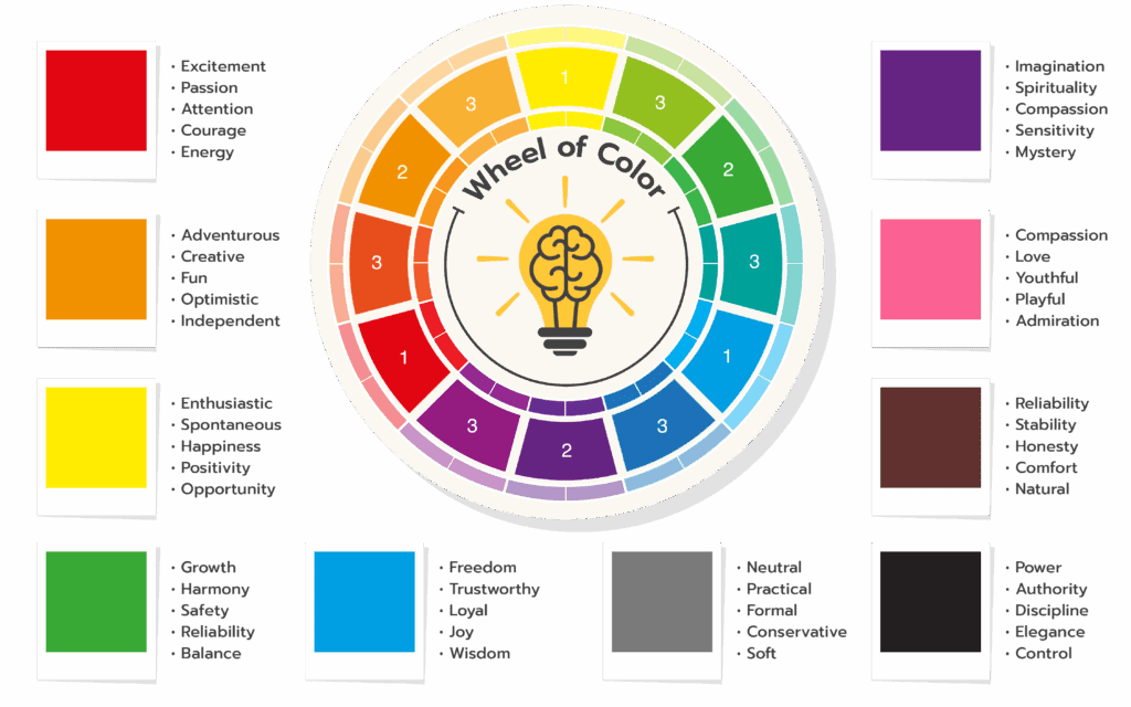
Red: Energy, Passion, and Urgency
Red logos evoke excitement, passion, attention, courage, and energy. This is the color that makes your heart rate speed up—literally.
Best for: Brands that want to ignite action, create urgency, or tap into bold, passionate energy. Think food and beverage brands, entertainment, or call-to-action buttons.
Use with caution if: You want to communicate calm, trust, or luxury.
Orange: Creativity and Optimism
Orange evokes adventure, creativity, fun, optimism, and independence. It’s the extroverted cousin of red—energetic but more approachable.
Best for: Creative businesses, children’s brands, adventure/outdoor companies, or any brand that wants to feel friendly and innovative.
Yellow: Positivity and Opportunity
Yellow is enthusiastic, spontaneous, happy, positive, and evokes opportunity. It’s the color of sunshine and optimism.
Best for: Brands focused on joy, innovation, or affordability. Great accent color for drawing attention.
Use with caution if: You’re in finance or luxury sectors (it can read as inexpensive if not balanced carefully).
Green: Growth and Harmony
Green portrays growth, harmony, safety, reliability, and balance. It’s deeply connected to nature, health, and sustainability.
Best for: Wellness brands, eco-conscious businesses, financial services (growth/prosperity), and any brand emphasizing balance or natural products.
Blue: Trust and Reliability
Blue represents freedom, trust, loyalty, joy, and wisdom. It’s the most universally liked color and the go-to for corporate branding.
Best for: Professional services, healthcare, technology, finance—anywhere trust and reliability are paramount.
Why it’s so popular: Blue builds credibility without being aggressive. It’s calming, confident, and approachable.
Purple: Creativity Meets Luxury
Purple evokes imagination, spirituality, royalty, sensitivity, and mystery. It sits at the intersection of creativity and sophistication.
Best for: Luxury brands, creative services, wellness/spiritual businesses, or brands targeting a predominantly female audience.
Pink: Compassion and Playfulness
Pink portrays compassion, love, youth, playfulness, and admiration. It ranges from soft and nurturing to bold and modern.
Best for: Beauty and wellness brands, businesses focused on care and empathy, or modern brands reclaiming pink as bold and empowering.
Brown: Reliable and Natural
Brown is reliable, stable, honest, comforting, and natural. It feels grounded and authentic.
Best for: Organic/natural products, coffee brands, rustic/artisan businesses, or brands emphasizing heritage and authenticity.
Gray: Sophisticated Neutrality
Gray represents being neutral, practical, formal, conservative, and soft. It’s the ultimate professional neutral.
Best for: Tech companies, modern/minimalist brands, or as a sophisticated supporting color in your palette.
Black: Power and Elegance
Black evokes power, authority, discipline, elegance, and control. It’s timeless, bold, and luxurious.
Best for: Luxury brands, fashion, high-end services, or brands wanting to project authority and sophistication.
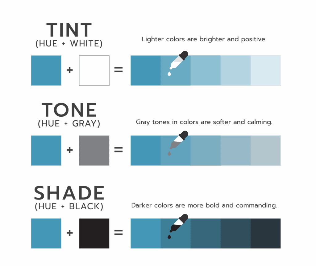
Beyond the Basics: How Color Variations Change the Message
Here’s where it gets interesting: within every color is a range of emotions depending on its shade, tint, or tone.
Adding white to a hue (creating a tint) makes it lighter, softer, and more approachable. Adding gray (a tone) makes it more sophisticated and subdued. Adding black (a shade) makes it bolder, more dramatic, and intense.
For example:
- Bright red screams energy and urgency
- Deep burgundy suggests luxury and sophistication
- Soft coral feels warm and approachable
This is why two businesses can both use “blue” but communicate completely different messages. A bright turquoise feels playful and creative, while a deep navy communicates corporate trust and authority.
Creating a Brand Color Palette That Works
Choosing individual colors is just the beginning. The real magic happens when you combine colors strategically to create a cohesive brand palette.
Color Harmony Creates Visual Appeal
Bold, complementary color palettes (colors opposite each other on the color wheel) project confidence and energy. They grab attention and make a statement.
Softer, monochromatic schemes (variations of a single color) signify elegance, simplicity, and sophistication. They feel cohesive and calming.
Analogous palettes (colors next to each other on the wheel) create harmony and balance—perfect for brands wanting to feel approachable yet professional.
Your Palette Should Reflect Your Brand Values
When I work with clients on brand identity design, we don’t just pick colors we like. We choose colors that:
- Align with your brand values (What do you stand for?)
- Resonate with your target audience (Who are you speaking to?)
- Differentiate you from competitors (What makes you different?)
- Work across all applications (Website, print, social media, etc.)
This strategic approach is what transforms a collection of colors into a visual language that tells your brand story.
Color Psychology in Action: Real-World Brand Examples
Think about the brands you interact with daily:
- Financial institutions overwhelmingly use blue (trust, stability, reliability)
- Eco-conscious brands lean into green (sustainability, natural, growth)
- Luxury brands favor black, gold, or deep jewel tones (sophistication, exclusivity)
- Children’s brands use bright, primary colors (fun, energetic, playful)
- Health and wellness companies often use calming blues and greens (serenity, balance, health)
These aren’t coincidences. They’re strategic color choices designed to communicate specific messages to specific audiences.
How to Choose the Right Colors for Your Brand
If you’re struggling with your brand colors (or DIY-ing your way through Canva trying to find something that feels right), here’s my advice:
Start with strategy, not aesthetics
Ask yourself:
- What emotions do I want my brand to evoke?
- What values are most important to my business?
- Who is my ideal client, and what resonates with them?
- How do I want to be different from my competitors?
Consider cultural context
Colors carry different meanings in different cultures. If you’re serving a global or specific cultural audience, research how your color choices might be interpreted.
Test across applications
Your colors need to work on your website, business cards, social media, packaging, and anywhere else your brand shows up. Make sure your palette is versatile enough to function in all these spaces.
Trust the process (and maybe hire a professional)
Color psychology is just one piece of brand identity design. When you work with a brand designer, you’re not just picking pretty colors—you’re building a strategic visual system that positions your business for success.
The Bottom Line: Your Brand Colors Are Working For You (Or Against You)
In a crowded marketplace where everyone’s competing for attention, your brand colors can be the difference between “scroll past” and “wait, tell me more.”
They’re creating impressions, evoking emotions, and communicating your values—all before someone reads a single word.
So what are your brand colors saying? If the answer isn’t clear, or if they’re not saying what you want them to, it might be time for a refresh.
Ready for Brand Colors That Actually Work?
If you’re an entrepreneur or small business owner tired of guessing at color choices (or stuck in Canva confusion), I can help you create a strategic brand palette that connects with your audience and reflects your values.
I specialize in brand identity design, logo design, and color strategy for mission-driven businesses ready to show up with confidence.
Let’s talk about your brand or explore my branding services to see how strategic design can transform your business.
Amanda Newman Design helps entrepreneurs and small businesses create purposeful brand identities through strategic logo design, color psychology, and visual storytelling. Based in Paducah, Kentucky, I design brands that feel authentic, connect emotionally, and stand out in competitive markets.
blog
BACK TO THE


