

June 23, 2024
Nonprofit Branding That Empowers: A Logo Design Case Study for Merryman House

When a domestic violence advocacy organization reaches out for a brand refresh, the stakes are high. Your visual identity isn’t just about looking professional—it’s about communicating safety, strength, and hope to survivors in their most vulnerable moments.
That’s exactly what Merryman House Domestic Crisis Center needed when they came to me for a complete branding package.
The Mission Behind the Brand
Merryman House is committed to improving the lives of those affected by intimate partner violence—women, men, and children. Their work saves lives. Their brand needed to match that level of impact.
They wanted branding that felt:
- Calming (creating a sense of safety for survivors)
- Professional (building trust with community partners and donors)
- Empowering (reflecting the strength and resilience of those they serve)
The challenge? Balancing softness with strength, approachability with authority—all while honoring the serious nature of their mission.
The Brand Strategy: Inclusive, Safe, Strong
Before diving into logo design or color selection, I started with what I always do: research and strategy.
I spent time understanding:
- The emotional journey of survivors seeking help
- How domestic violence organizations communicate safety
- What visual cues build trust in crisis situations
- The values at the core of Merryman House’s work: Saving, Building, and Changing Lives
This groundwork shaped every design decision that followed—from the serene color palette to the modern typography that balances softness with strength.
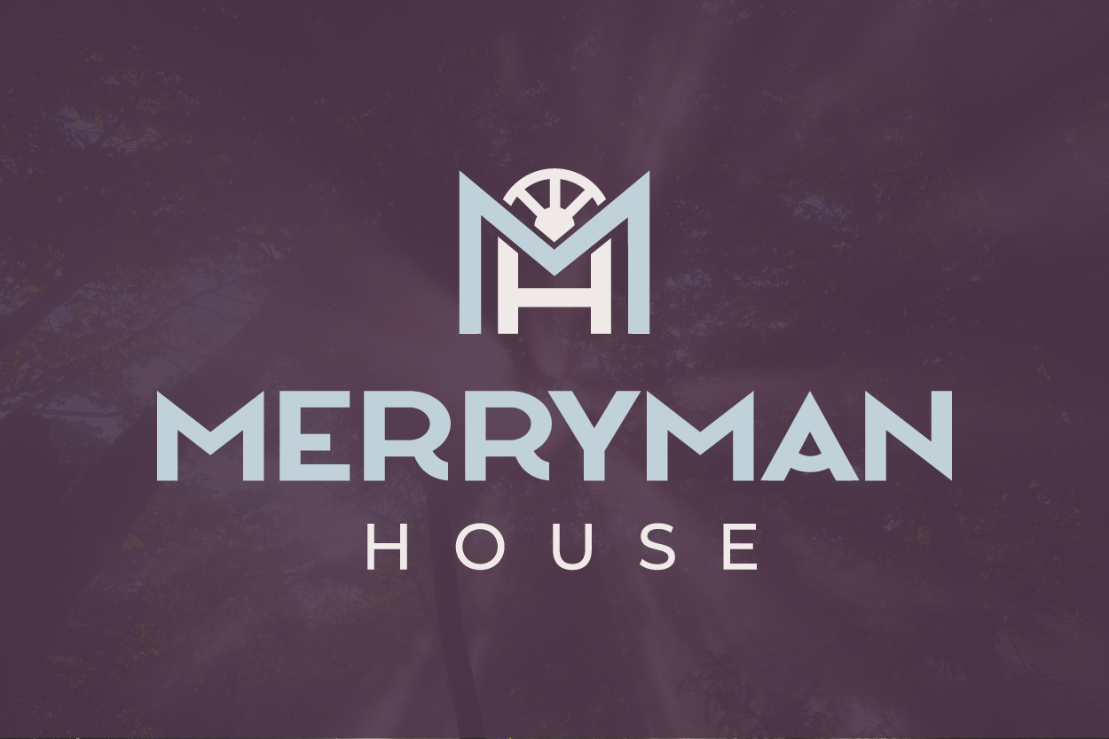
Logo Design: A Symbol of Shelter and New Beginnings
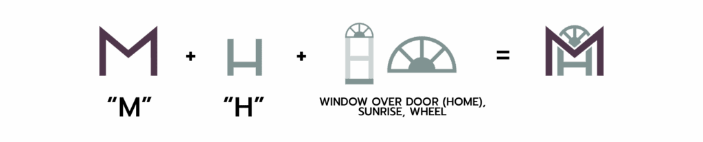
Merryman House opted for a monogram-style logo, using the letters “M” and “H” to create a meaningful symbol that goes deeper than just their initials.
The Design Details That Matter
Every element was intentional:
The Monogram Structure
A strong, modern typeface represents security and stability. The larger “M” cradles the “H” inside, symbolizing shelter and protection—the literal safe house they provide.
The Half Circle with Three Rays
This element does triple duty, representing:
- Home and safety (the arc of a roof)
- Sunrise and new beginnings (hope for survivors starting fresh)
- Their three core values (Saving, Building, Changing Lives)
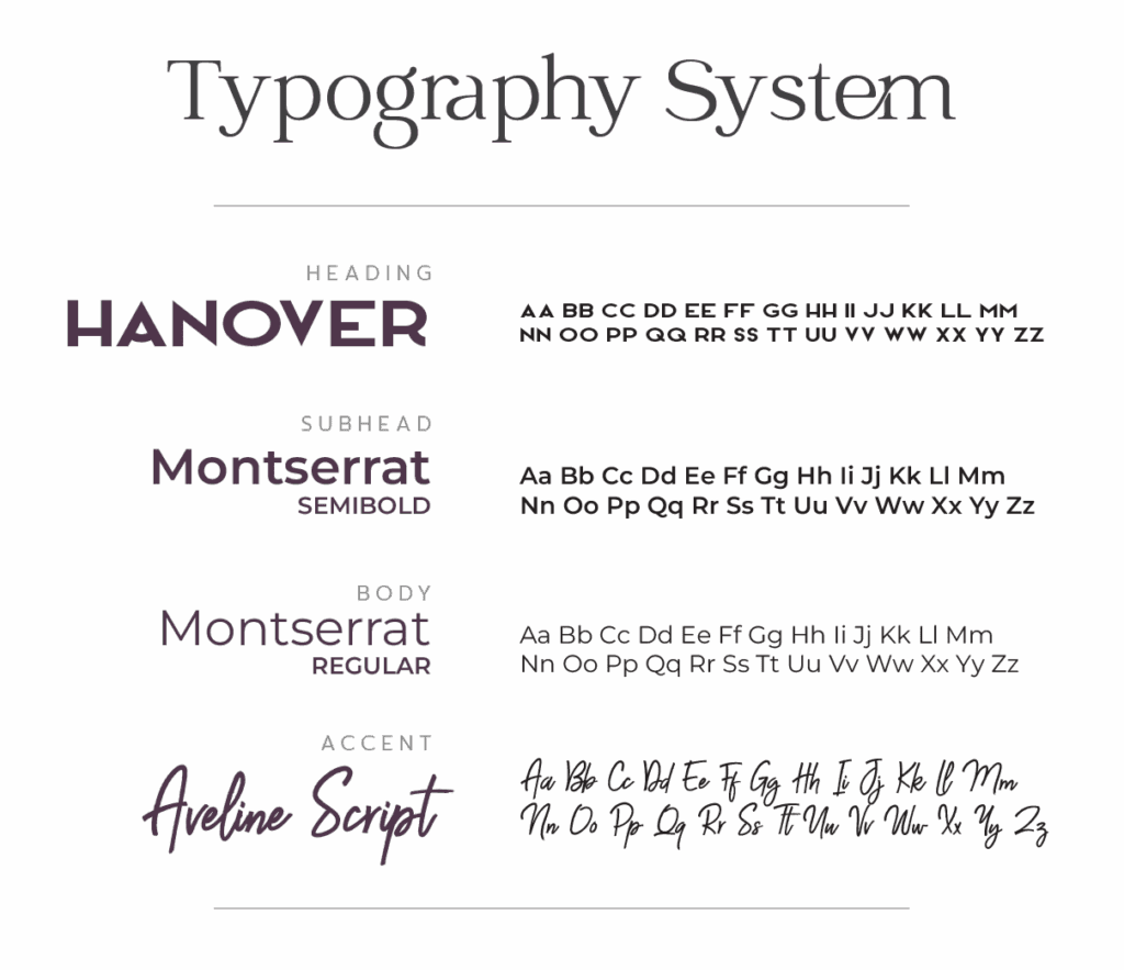
The Typography
Bold, clean fonts communicate strength without aggression—important when your audience includes people healing from trauma.
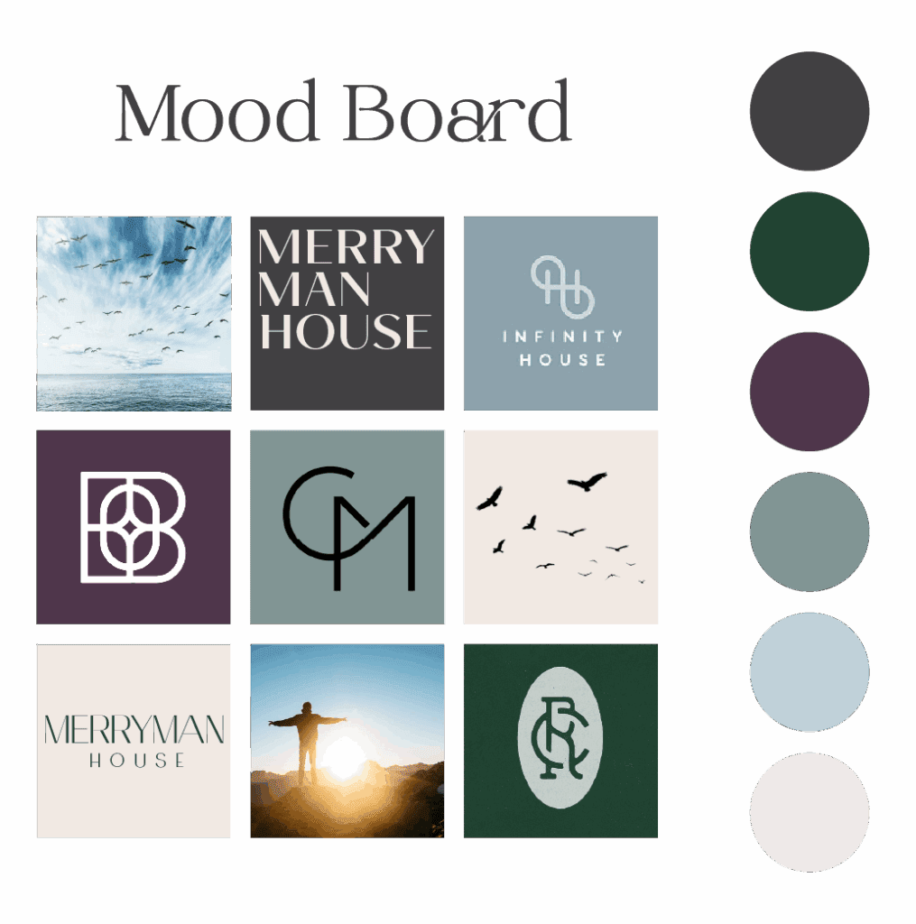
The Color Palette
Serene, calming colors create an immediate sense of peace while maintaining the professional credibility needed for grant applications, community partnerships, and public advocacy.
What the Client Said
“We loved Amanda’s process from start to finish. The information-gathering she did up front was thoughtful and thorough, and the input we got to give halfway through the conceptual process gave us a small idea of what to expect from the final product. When we did see the final product, we were pleasantly surprised by how many of our ideas she was able to incorporate in ways we never would have thought of alone. She was responsive throughout, kept to the agreed-upon timeline, and delivered a logo package we feel truly reflects our organization’s services and values.”
— Kayla Myers, Director of Community Engagement, Merryman House Domestic Crisis Center
Beyond the Logo: Building a Complete Brand System
A logo alone doesn’t make a brand. Merryman House received a comprehensive branding package designed to set their team up for long-term success.
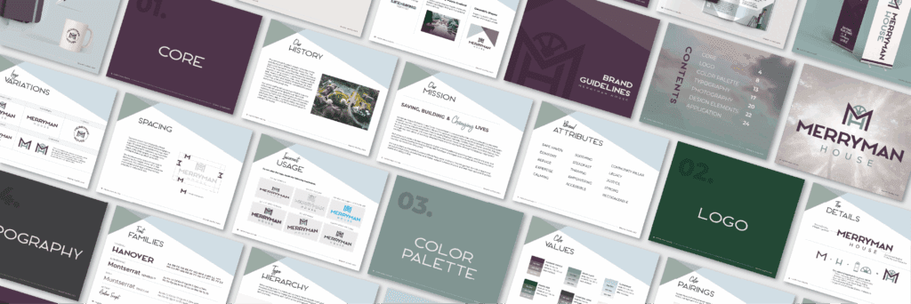
The Brand Book: Your Brand’s Instruction Manual
One of my favorite deliverables for nonprofit clients is the Brand Book—a 20+ page guide that outlines exactly how to use every element of the brand identity.
This isn’t just a “nice to have.” It’s critical for organizations with:
- Multiple staff members creating marketing materials
- Board members who need to stay on-brand
- Volunteers designing event flyers
- Grant writers who need consistent presentation materials
The Brand Book ensures brand consistency across every touchpoint: website, social media, print materials, digital ads, email campaigns, presentations, and more.
When everyone on your team knows exactly how to represent your organization visually, your brand becomes instantly recognizable—and that recognition builds trust.
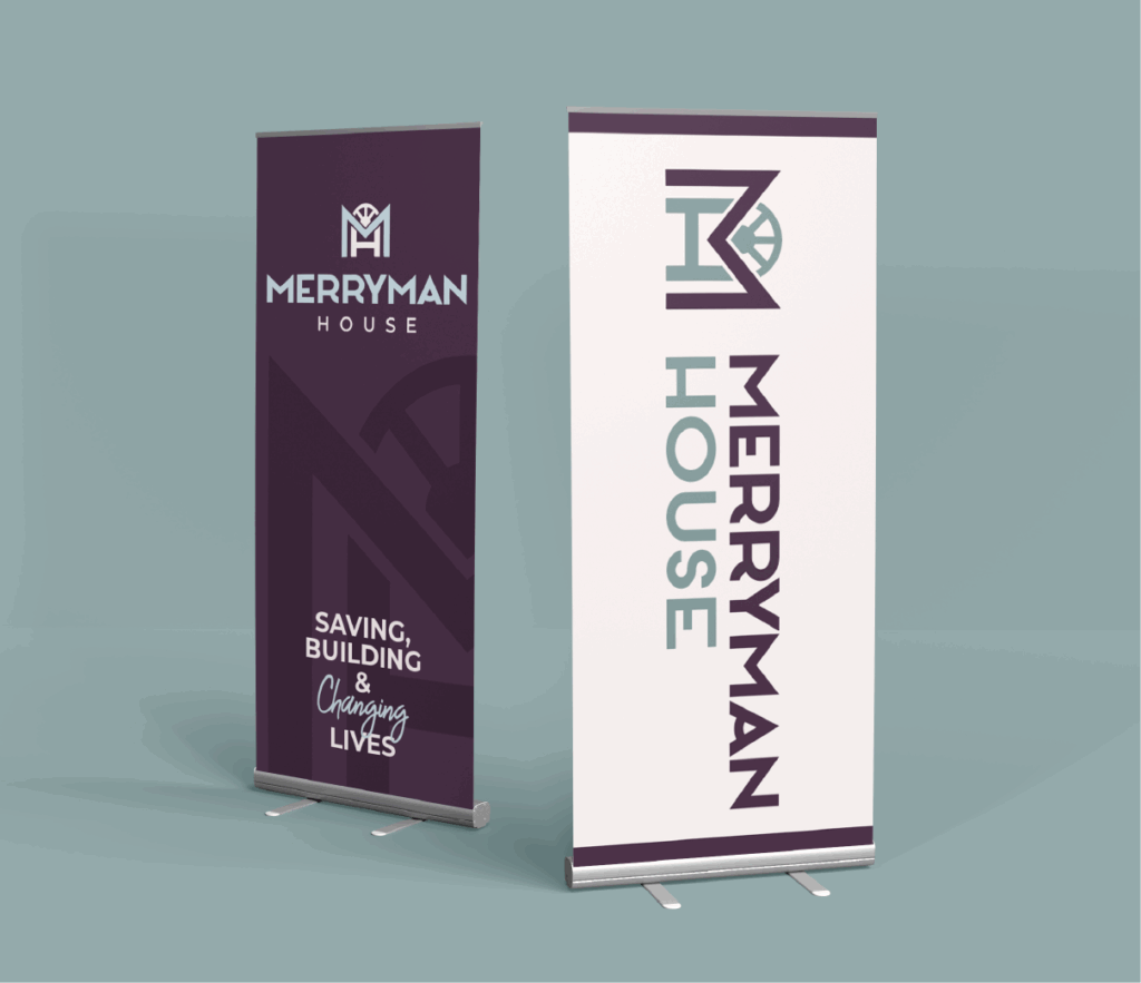
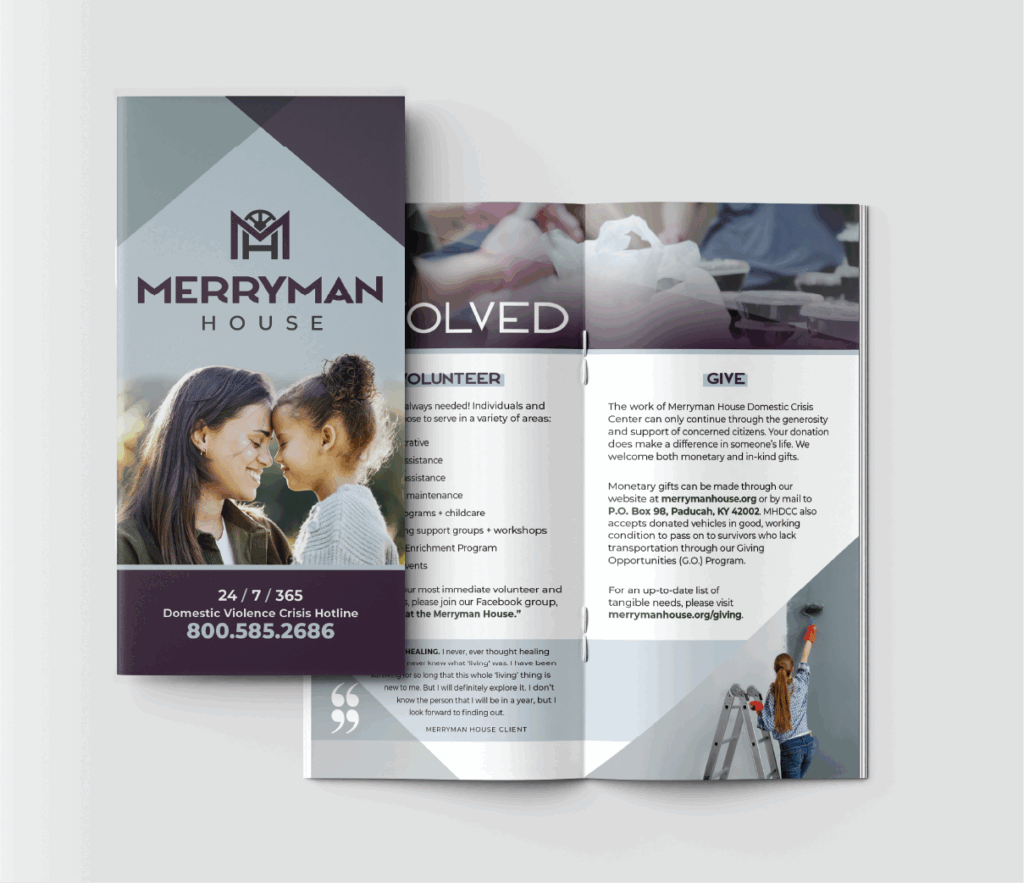
Marketing Collateral: Bringing the Brand to Life
The branding package also included a brochure design that tied all the visual elements together—showing how the logo, colors, typography, and design elements work in real-world applications.
This wasn’t just about making something pretty. It was about creating marketing materials that:
- Clearly communicate services to people in crisis
- Feel approachable and safe, not corporate or cold
- Work in both digital and print formats
- Empower staff to share their mission confidently
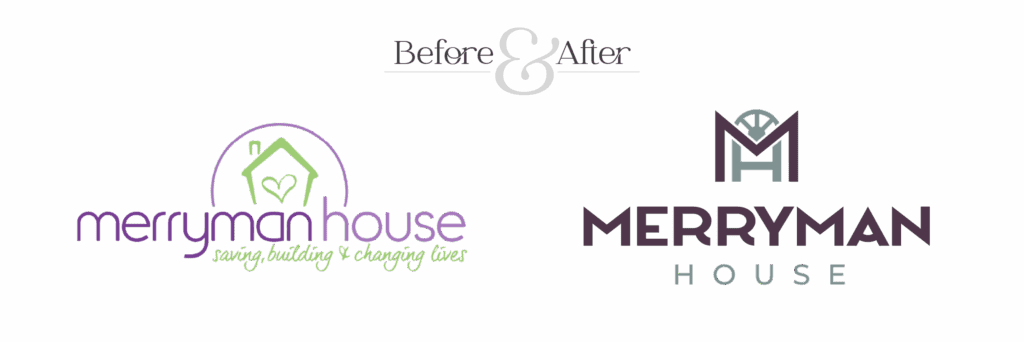
The Transformation: Before and After
The result? A complete brand refresh that reflects the inclusivity, safety, and strength at the heart of Merryman House’s advocacy work.
The serene colors and bold typography weren’t random aesthetic choices—they were strategically curated to mirror the empowering nature of the organization and resonate with survivors, supporters, and community partners alike.
Why Nonprofit Branding Matters
Organizations like Merryman House deserve branding that matches the weight of their work. When your mission is to save lives, your brand should communicate that with clarity, professionalism, and heart.
If you’re a nonprofit leader wondering whether branding is worth the investment, consider this: Your visual identity is often the first impression someone has of your organization. For a survivor searching for help, that first impression could make the difference between reaching out or staying silent.
Your brand should make people feel safe saying yes.
Ready for Branding That Reflects Your Mission?
If you’re a nonprofit or small business doing meaningful work in the world, I’d love to help you create a brand identity that honors your mission and connects with the people you serve.
I specialize in nonprofit branding, logo design, and brand strategy for organizations ready to show up with confidence and clarity.
Let’s talk about your project or explore more case studies to see how strategic design can transform your organization’s impact.
Amanda Newman Design creates purpose-driven branding for nonprofits, entrepreneurs, and small businesses. Based in Paducah, Kentucky, I help mission-focused organizations translate their values into visual identities that build trust, recognition, and lasting impact.
blog
BACK TO THE


